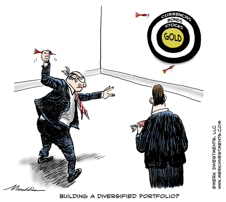
30%+ Gold in a Diversified Portfolio?
Axel Merk, Merk Investments December 10th, 2013 How can an investor get guidance on how to construct a portfolio that will protect them should the stock market have another losing streak that lasts more than a few days? We discuss this question while specifically looking at how much gold an investor may want to hold in a portfolio.
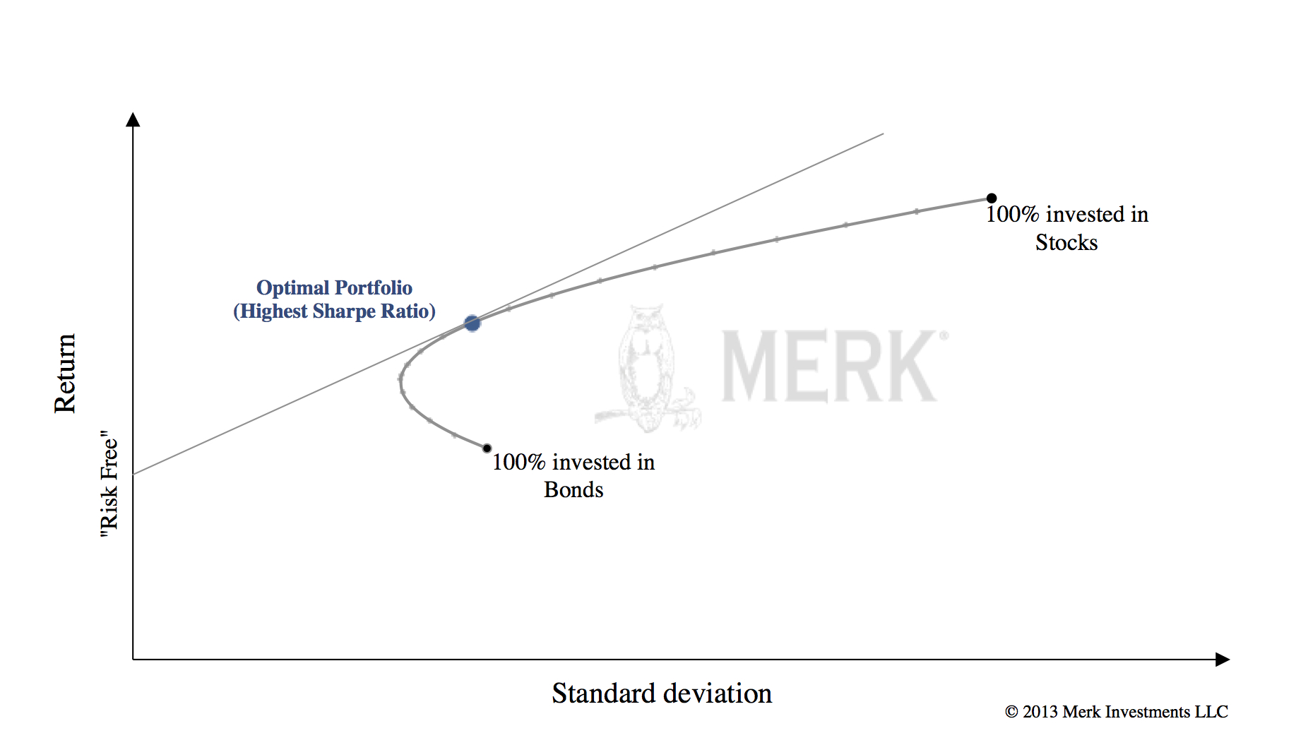
In 1934, the price of gold was $35 an ounce; as of September 30, 2013, it was $1,331, yielding an average return of about 5%? Gold bugs might argue this suggests gold should have a permanent place in investors’ portfolios. Conversely, however, those thinking the yellow metal is a barbarous relic, may only see themselves confirmed in their view that gold is overpriced. Keep in mind, the same point can be made about stocks’: historical returns are not “proof” of future returns. Without endorsing either view, let’s have a look at how an investor could have combined gold and equities to enhance risk-adjusted returns. There’s an academic theory, the “Modern Portfolio Theory” that presents an “Efficient Frontier,” an investment mix that maximizes expected returns for a given amount of expected risk. An “Optimal Portfolio” provides the highest risk-adjusted return; often defined by professional investors as the portfolio with the highest Sharpe ratio, a measure of return per unit of risk as measured by standard deviation of returns. At first blush, our analysis may lead one to conclude investors may want to hold 30% or more in gold. However, we should really be asking the opposite question: is it sensible for investors to have up to 70%, possibly more, of their portfolio in stocks?
Adding Gold in an Optimal Portfolio
Let’s see what an “Optimal Portfolio” containing gold and equities would have looked like over different time horizons:
While a 5-year horizon appears reasonably long, keep in mind that five years ago, we were right at the peak of the financial crisis. To address this, we also choose August 1971 as a reference point to gauge the long-term performance of gold; it was on August 15, 1971, that President Nixon ended the convertibility of the dollar to gold. While that is truly a long-term horizon, one could argue that the gold price was artificially depressed until then; and, as a result, any return calculated since then might overstate the potential long-term rate of return for gold. To address that criticism, as a third variant, we went all the way back to the beginning of 1934: that year, the Gold Reserve Act changed the nominal price of gold from $20.67 per troy ounce to $35. Before looking at these charts, keep in mind:
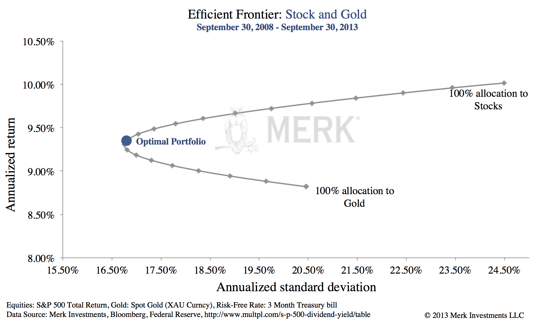
Stocks & Gold: 5-Year Efficient Frontier
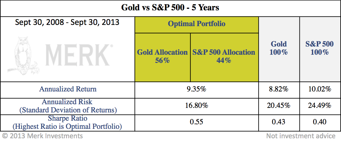
The chart above suggests that given a choice between investing in the S&P 500 and gold, an investor would have had the best risk-adjusted returns investing 56% in gold and 44% in the S&P 500. Allocating more to equities might have yielded higher returns, but the volatility of returns would have been substantially higher. Does this mean an investor should have more than half of their investable assets in gold? No, among other reasons, because:
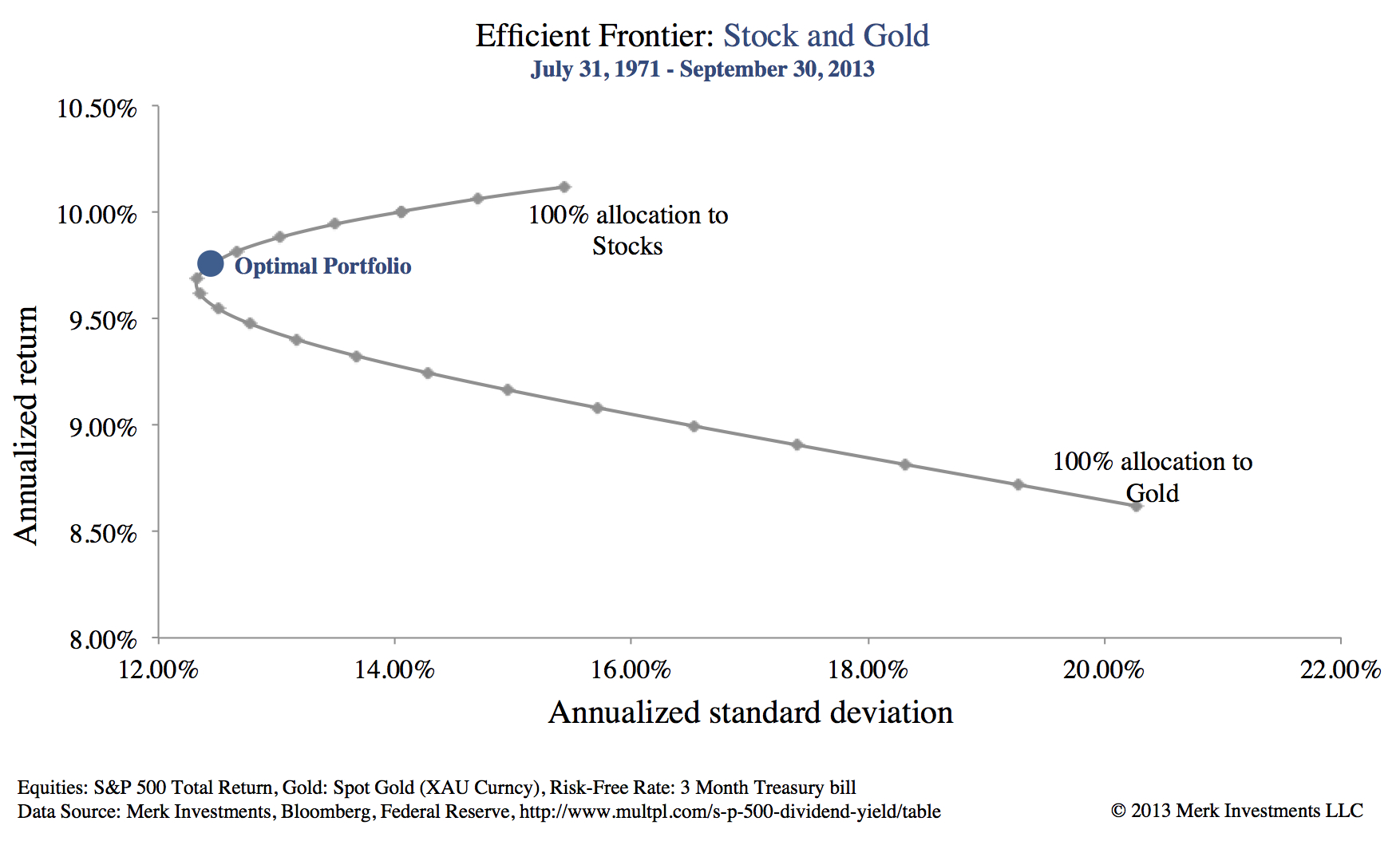
One possible conclusion is that adding any uncorrelated asset to the S&P 500 may improve an overall portfolio. But the above chart also suggests that if one’s outlook for gold or the S&P 500 is different from what it has been in the past five years, the “Optimal Portfolio” may look different. Let’s look at a longer-term chart. Stocks & Gold: Efficient Frontier Since August 1971
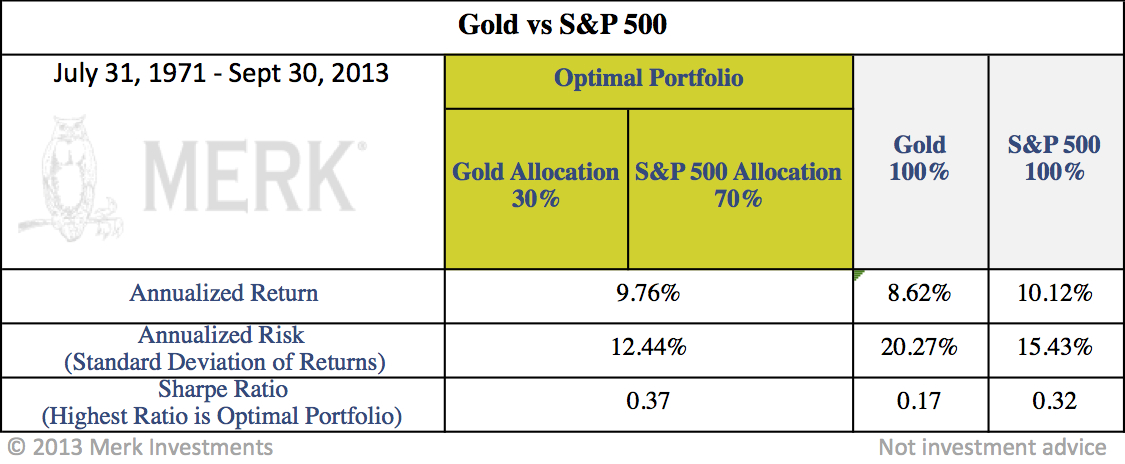
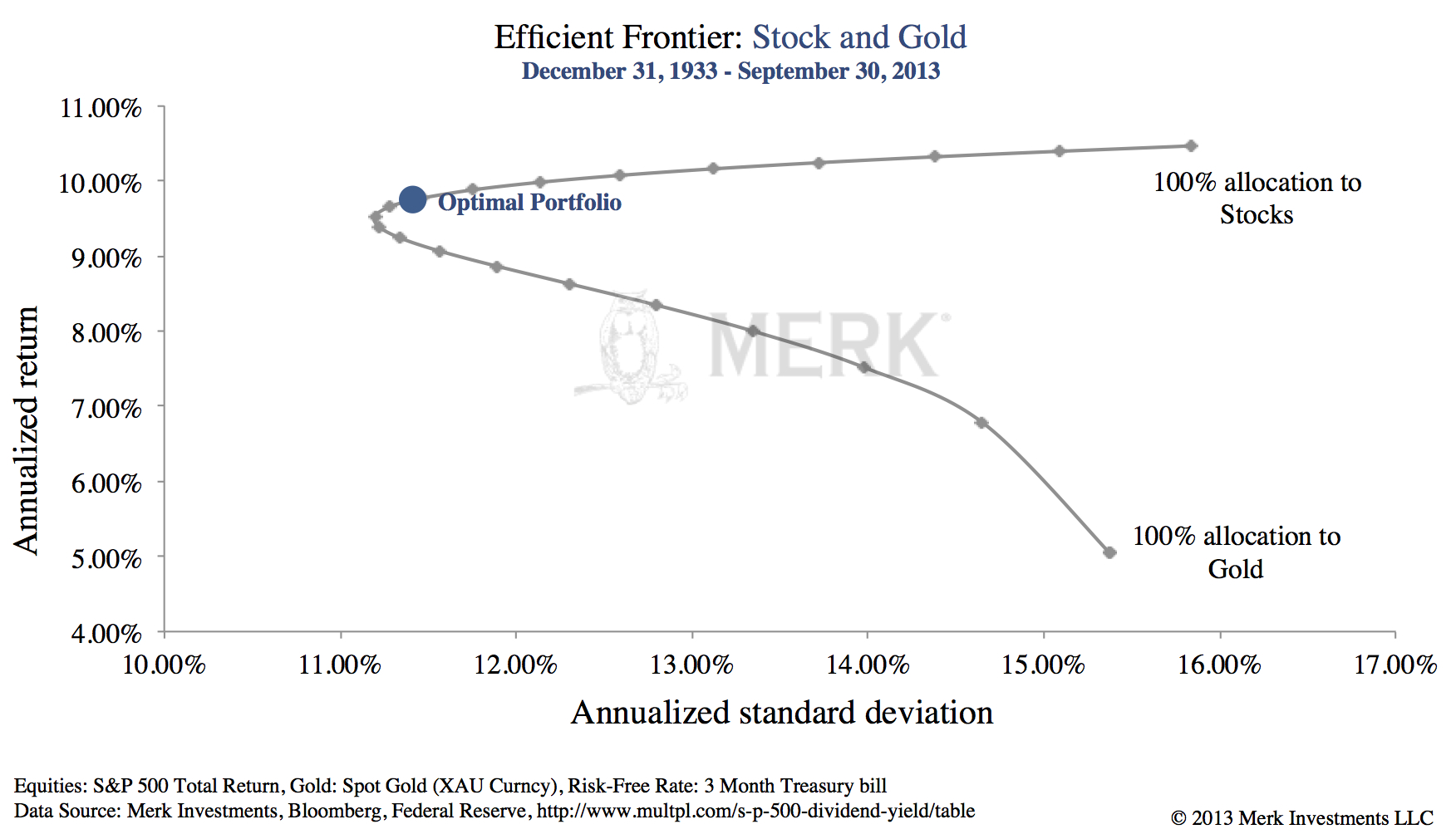
Going back to August 1971, the optimal gold allocation drops from 56% to 30%. Mind you, this includes the run-up in 1980, as well as the subsequent 20-year bear market in gold that followed. It’s likely there aren’t many investors that piled up on gold and the S&P back in 1971, then never rebalanced their portfolio. Still, the takeaway should be that diversification with uncorrelated assets matters, as it is possible to substantially lower the volatility of a portfolio by adding an uncorrelated asset. That applies despite the fact that gold was more volatile than the S&P 500 since 1971 (different from the risk profile over the most recent 5 year period where gold was less volatile than the S&P 500). Now, let’s go back almost 80 years: Stocks & Gold: Efficient Frontier Since 1934
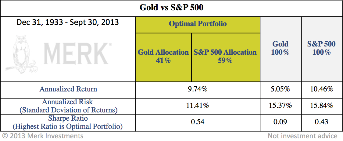
Allocating 41% to gold since 1934 would have, according to the theory, provided the “optimal” risk adjusted return: by sacrificing just a little in return, the overall volatility of the portfolio could have been substantially lowered. A couple of caveats:
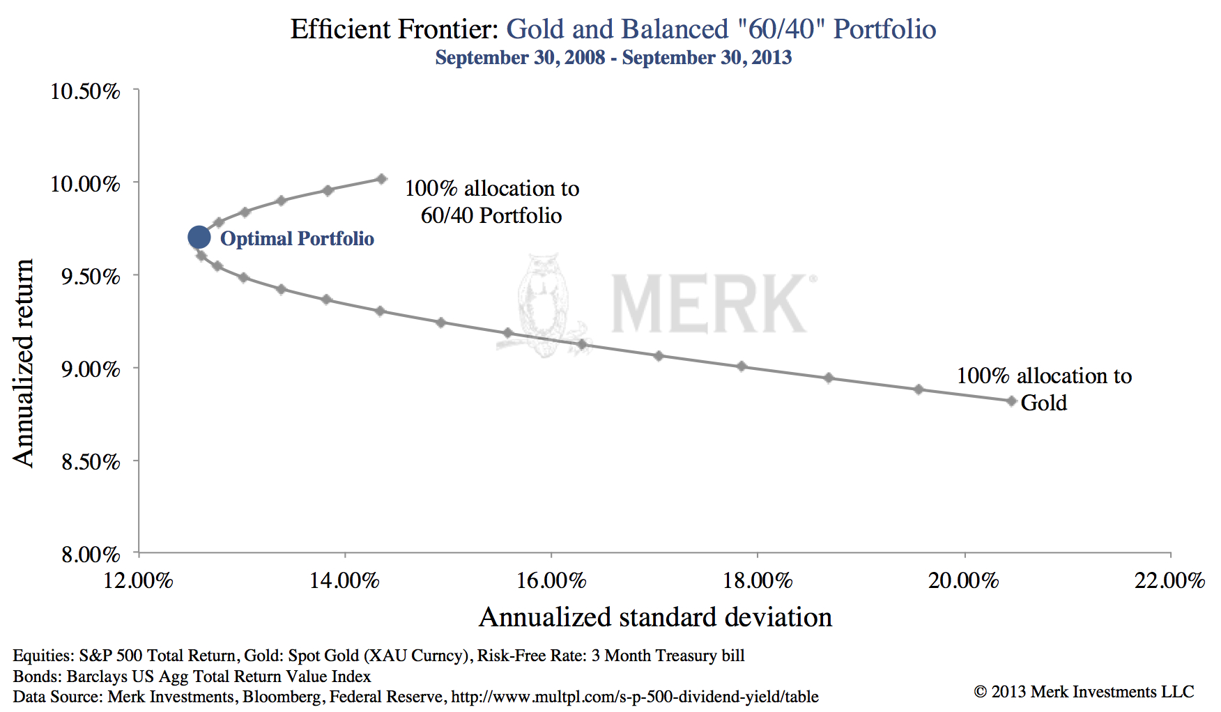
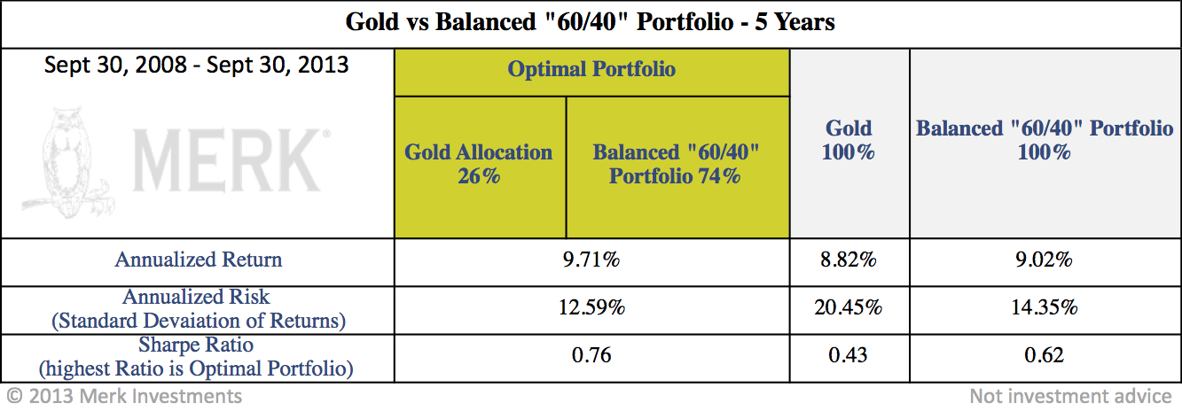
Gold in a Balanced “60/40” Portfolio: 5-Year Efficient Frontier With this context provided, let’s look again at the past 5 years, but this time, adding bonds into the mix. We assume a static 60/40 ratio of stocks to bonds, often referred to as a “Balanced Portfolio,” then add the “optimal” amount of gold to the mix – again using hindsight:
Unlike the first example that suggested a 56% allocation to gold, a 36% allocation to gold added to a “Balanced Portfolio” would have yielded the “Optimal Portfolio.” Here, gold outperforms the balanced portfolio by a tad, yet one can lower the overall risk profile of a balanced portfolio by adding a gold component. Clearly, past returns are no proof of future results. Will the seemingly meteoric rise of stocks continue? Haven’t we reached a peak in bonds? In fact, over the past 5 years, bonds came out way ahead as the volatility in bonds was abnormally low; this changed as of the “taper talk” earlier this year. And even if one likes the value proposition of gold, it’s only prudent to take into account that the recent negative returns may continue. If one extrapolated from the recent negative returns of gold, the “Optimal Portfolio” may well suggest a 0% allocation to gold, assuming other asset classes yield positive returns. What is the Market? Better Alternatives? Most investors don’t allocate 30%+ of their portfolio to gold; neither can we make such an investment recommendation. But as limited as the analysis here is, we should really be asking the opposite question: is it sensible for investors to have up to 70%, possibly more, of their portfolio in stocks? What this exercise shows that investments that adding investments with low correlation to stocks may improve a portfolio by enhancing its risk-adjusted return. Aside from including international stocks and bonds, other candidates to consider for inclusion in an investment portfolio are:
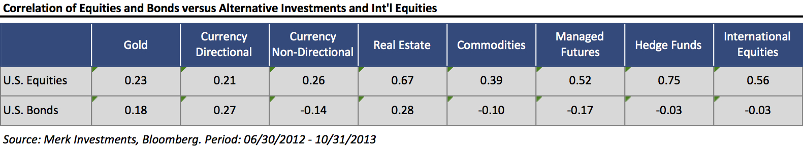
What correlation? To find an Optimal Portfolio, it’s important how the underlying securities in the portfolio interact with one another. But that’s not so trivial, as correlations across securities and asset classes are not stable. To illustrate the point, most have heard that the U.S. dollar benefits from a “flight to safety.” That may have been the case for a little over two years up to the summer of 2012, but ever since then, the “risk on” / “risk off” trade became more complicated. Or when money fled emerging market local debt where investors thought they could have a free lunch picking up yield with little risk, such money didn’t go into the U.S. dollar, but started to chase yields in government bonds of weaker Eurozone countries. Or take gold: there are periods it moves in tandem with the stock market, others where it moves in the opposite direction. Indeed, there are periods when gold has been a hedge against a falling stock market; but it’s not always inversely correlated with the stock market. Gold may also thrive in a rising interest rate environment, as it did in the late 1970s. Here’s a selection of other alternative investments and how they correlate to both equities and bonds:(*)
Note that, in recent years, international equities have had a comparatively high correlation to the S&P 500. We have been arguing for some time that investors in international stocks may have primarily been receiving additional return through commensurately higher risk rather than improving the overall return/risk profile of their portfolios. As a result, we encourage investors to consider truer forms of diversification, noting that currency strategies may provide particularly low correlation to U.S. stocks and bonds. Gold is a well-known way to diversify out of the U.S. dollar, however there may be other opportunities worth exploring further. What return? The theory works best when we plug in “expected” returns. Wouldn’t it be great if we knew tomorrow’s return? In practice, many investors use historical returns. As you might imagine, these models heavily favors assets that had a good return during the given look-back period – so don’t think the result is unbiased simply because you let a computer generate results. Indeed, one of the biggest challenges in presenting Optimal Portfolios is that they are heavily influenced by the underlying assumptions. Someone can show you that a given investment would have made a fantastic addition to your portfolio, but you may want to look more closely whether the assumptions are realistic going forward. What risk? Just as returns play a role, so does risk. In finance, a lot of investors employ standard deviation of returns as a measure of risk. Yet many investors are just fine with “upside risk,” but do have a problem with “downside risk” (there’s a measure for that, the Sortino ratio). Maybe just as relevant, these models are not very good at capturing high risk, low probability events, also called market crashes. In other words, an optimization analysis that uses historical returns may understate risk if the time period used does not capture a market crash in that given asset. Further, many measures of risk are relative to a benchmark “risk free” rate; but in today’s world, one might argue that there’s no such thing as a risk free investment in an environment with negative real interest rates given that one’s purchasing power is at risk no matter what one does. Optimal Portfolio: Really? The takeaway from this exercise may be to look at alternatives in general as a supplement to a traditional equity and bond portfolio. Investors may want to take a pro-active approach to learn how to add value to a portfolio, keeping an open mind about the risks and opportunities out there, especially after the run-up the stock market has had. To invest profitably, it may be more about developing a robust investment process rather than plugging in make believe numbers into a model. We will publish more analyses on how to diversify in times like these. Please subscribe to Merk Insights and follow me on Twitter to be informed as we publish more analyses on how to diversify in times like these. Also join me for a Webinar on Tuesday, December 17, 2013, discussing how to diversify when bonds are at risk and stocks expensive. Finally, please read our gold white papers & reports. Axel Merk (*) An investor cannot invest directly in an index. Alternative investments are represented by the following indices:
|